
Responsive Design #
In this lab, you will learn how to differentiate CSS for mobile viewing and continue exploring CSS design properties.
[0] Set up #
💻 Start by cloning your starter code.
Be sure to change yourgithubusername to your actual Github username.
cd ~/desktop/making_with_code/unit04_webdesign
git clone https://github.com/the-isf-academy/lab_responsive_design_yourgithubusername
💻 cd into the lab
cd lab_responsive_design_yourgithubusername
📄 This repo contains the following:
index.htmlstyles.cssassets/- contains 1 imagesREADME.md
💻 Start by openning the repo in VS code and opening the index.html page.
code .
open index.html
[0] Mobile Queries #
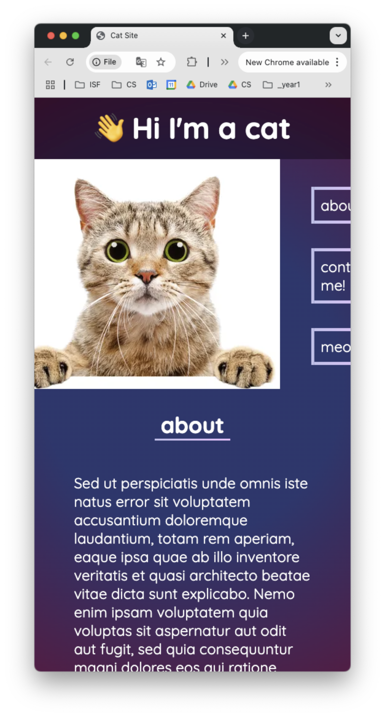
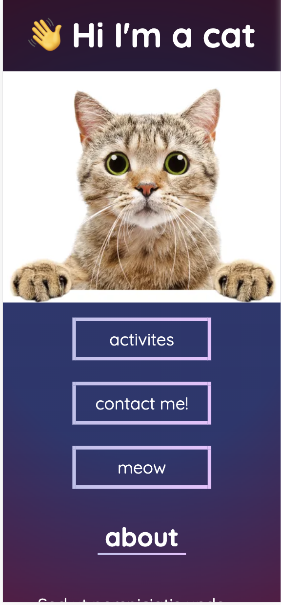
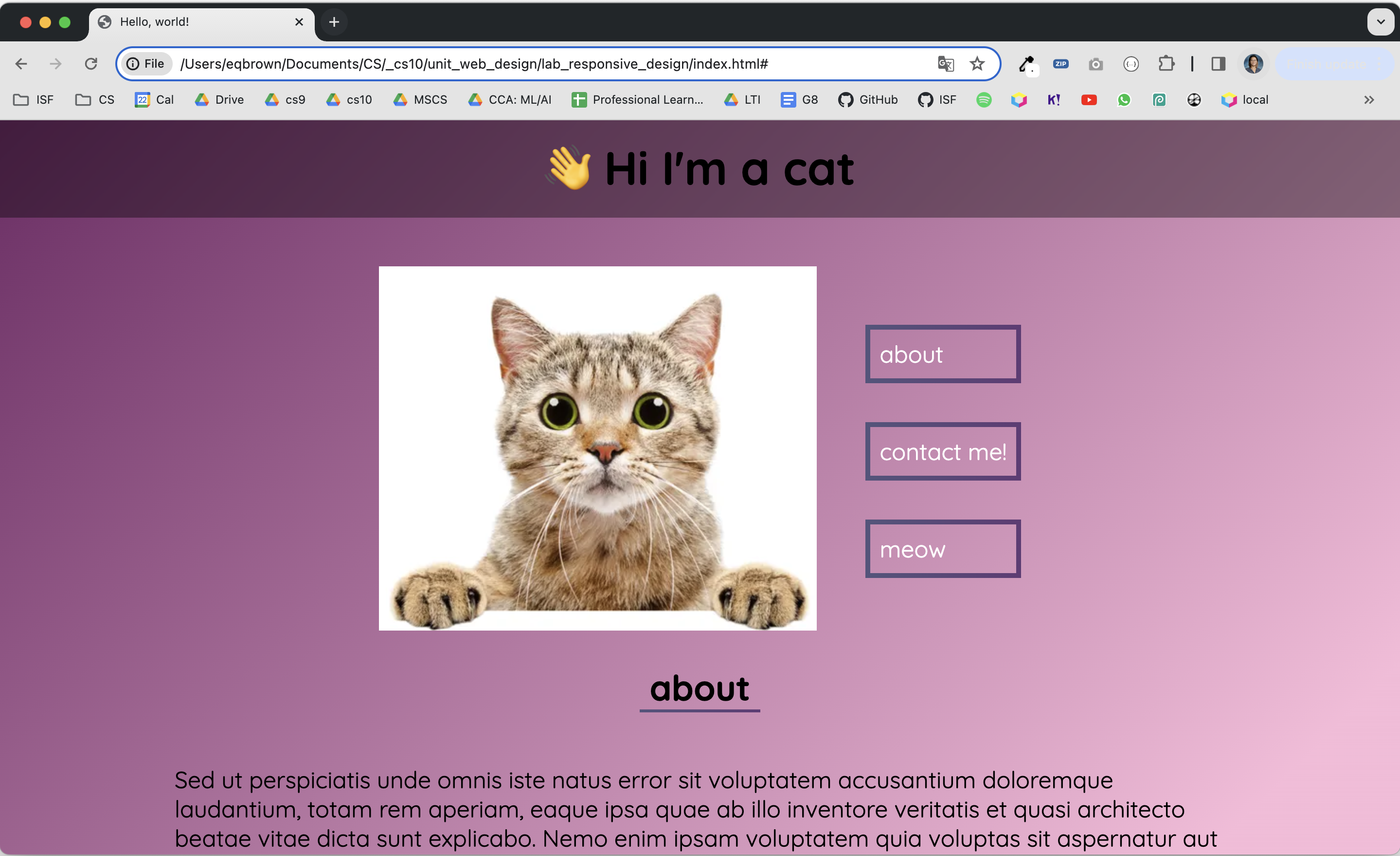
💻 Let’s start by resizing the window. As you resize the window, the content on the site does not get adjusted for the phone. The buttons are no longer visible and some of the text is mis-aligned.
💻 First, let’s look at the media query at the bottom of the styles.css file.
Media queries change the CSS properties for specific screen sizes
- learn more here
/* FOR SCREEN SIZE SMALLER THAN 767 PX */

@media (max-width: 767px) {
    .flexbox {
        display: block;
        margin-top: 0px;
    }
}
- by defining css rules inside the media query, you can overwrite specific properties
- by changing
display: blocktodisplay: flex, this forces the items to stack on top of each other
💻 Let’s change our display property to block instead of flex, so the content to stack on top of each other, instead of side by side. It’s looking better!
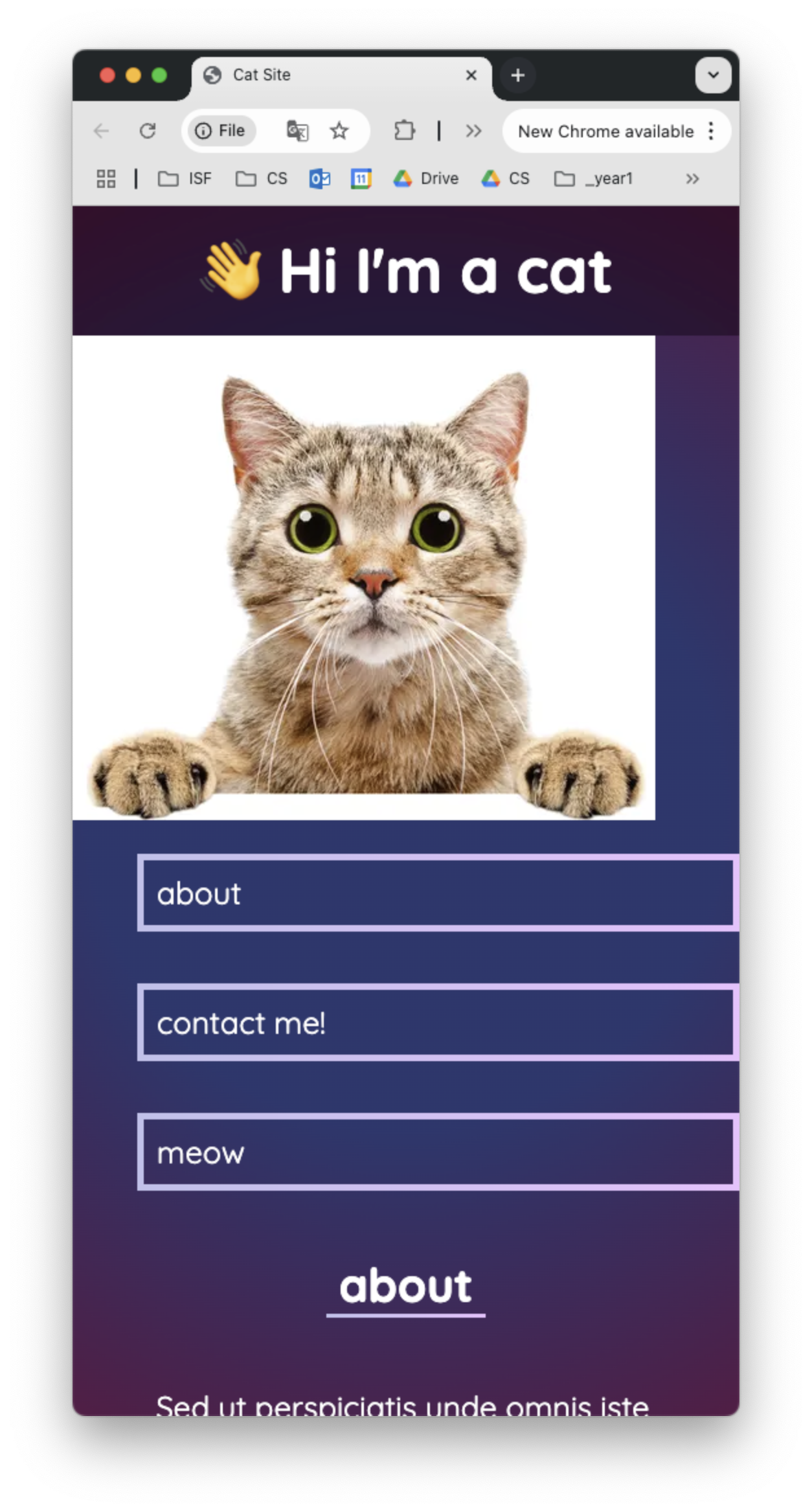
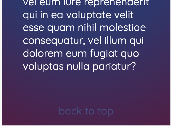
💻 Now, it’s up to you to edit the existing CSS rules and add more specific CSS rules in the media query! Try to match the screenshots below.
Don’t forget to scroll to the bottom and check the ‘back to the top’ text
- You must:
- add additional properties to the
.flexboxrule - create new rules for html elements in the media query
- add additional properties to the
[1] Customizing the Site #
Now that the mobile looks better, let’s improve the site!
[Internal Links] #
You can link to an internal part of your site by setting an id to an HTML element.
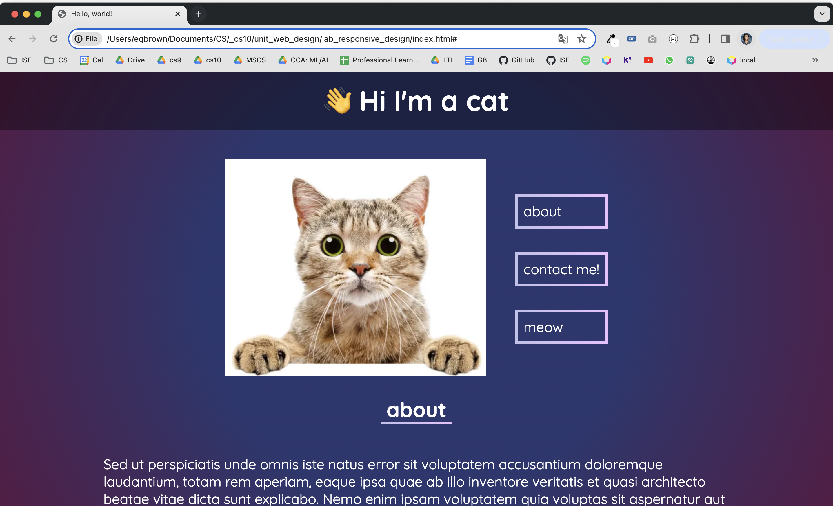
💻 Try clicking on the about link. It jumps you to the about section of the page. But, the contact me! and meow buttons are broken.
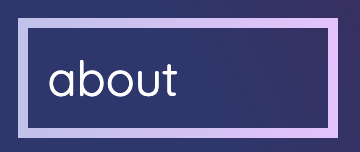
📖 This is the HTML code for the link. It’s href points to the id of the about section.
<a class="border-box" href="#about">about</a>
📖 This is the HTML code for the <h2> section heading.
<h2 id="about">about</h2>
💻 Fix the links for the contact me! and meow buttons so they jump you to the correct part of the site.
💻 Try clicking on the back to top link. It should jump you to top of the page, but it currently doesn’t work.

💻 Fix the link by refering th reference link to "#" The single hashtag represents the top of the page.
[Gradients] #
💻 Experiment with CSS graidents at cssgradient.io
💻 When you find one you like, copy the linear-gradient
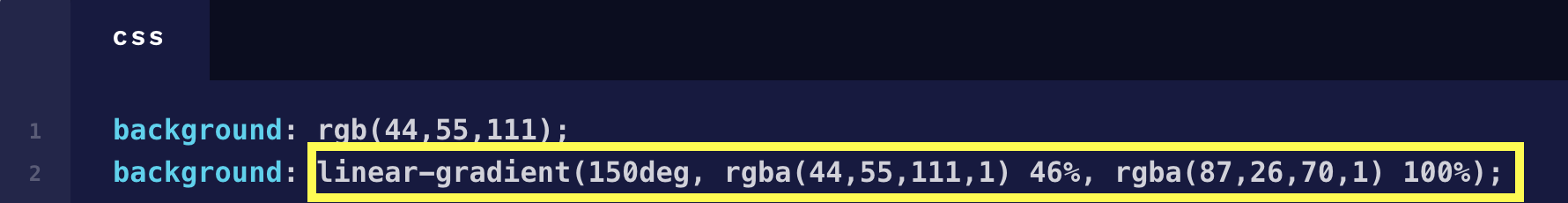
💻 Paste it into the top of your styles.css and replace the current --bg-graident value
These are
CSSvariables, which allow you to more quickly retheme your site - learn more here
:root {
    --bg-gradient: radial-gradient(circle, rgba(44,55,111,1) 46%, rgba(87,26,70,1) 100%);
    --border-gradient: linear-gradient(to right, rgb(193, 193, 237), rgb(234, 193, 255)) 1;
    --color1: white;
    --color2: rgb(67, 77, 131);
    --color3: rgb(93, 102, 148);
}
💻 Experiment with the other variables and change the theme to light mode.
[Animations] #
📖 For simple animations, we will use the Animate.css library:
animate.style
You can see an example of an animation when you refresh the site, the 👋 Hi I'm a cat flips in from the top of the screen.
h1{
    animation: flipInX;
    animation-duration: 1s;
}
💻 Customize your site by adding more animations! When adding an animation to the CSs properties, it MUST include the animation and animation-duration properties.
- view the animation options by clicking the options at animate.style
- experiment with animations when you hover an element
[2] Deliverables #
⚡✨ Once you've successfully completed the lab:💻 Push your code to Github.
- git status
- git add -A
- git status
- git commit -m “describe your code and your process here”
be sure to customize this message, do not copy and paste this line
- git push
[3] Extension: p5.js #
p5.js is a javascript library for creating digital artwork! You can take a look at the documentation
here.
👀 Take a look at the examples and experiment with the web editor.
💻 Then, try to bring it into your own site by referencing this example p5.js setup in a local HTML file. Feel free to copy & paste this into a new file OR bring parts of this into your existing index.html file.
<!doctype HTML>

<html>

    <head>
        <link rel="stylesheet" href="styles.css" >
        <meta name="viewport" content="width=device-width, initial-scale=1.0">
        <title>p5.JS Examples</title>
        <link rel="stylesheet" href="https://cdnjs.cloudflare.com/ajax/libs/animate.css/4.1.1/animate.min.css"/>
        <script src="https://cdn.jsdelivr.net/npm/p5@1.11.11/lib/p5.min.js"></script>
    </head>

    <body>

        <div id="p5jsCanvas">
        </div>
    </body>

    <script>
      function setup() {
        // Create the canvas
        var canvas = createCanvas(710, 400);
        canvas.parent('p5jsCanvas')

        // Set background to black
        background(1);

        // Set width of the lines
        strokeWeight(10);

        // Set color mode to hue-saturation-brightness (HSB)
        colorMode(HSB);

        // Set screen reader accessible description
        describe('A blank canvas where the user draws by dragging the mouse');
      }

      function mouseDragged() {
        // Set the color based on the mouse position, and draw a line
        // from the previous position to the current position
        let lineHue = mouseX - mouseY;
        stroke(lineHue, 90, 90);
        line(pmouseX, pmouseY, mouseX, mouseY);
    }


  </script>
</html>